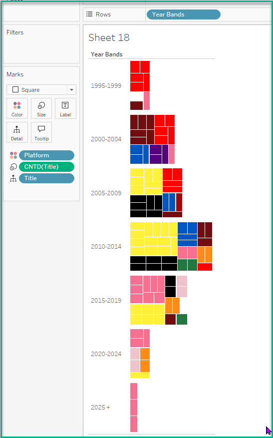
Tree map in a Bar Chart?
- Jan 12
- 2 min read
Bar charts are the number one chart used for analysis. In the next couple of blogs I want to review how to make different kinds of charts inside bars!
A tree map is a chart that is used for visualizing hierarchical data and part to whole relationships. You can easily embed one inside a Bar chart in Tableau!
I created one here in my first ever #GamesNightViz dashboard here on Lego Video Games!

#GamesNightViz is a project started by Iron Viz winner Will Sutton. Tableau Visionary Louis Yu is a part of this project as well! As an avid video gamer myself, I wanted to get involved in this project!
Steps to Create a Bar / Treemap chart
For my data set I created the following calculation for years:
Year Bands
IF YEAR([Year]) >= 2025 THEN "2025 +"
Elseif YEAR([Year]) >= 2020 AND YEAR([Year]) <= 2024 THEN "2020-2024"
ELSEIF YEAR([Year]) >= 2015 AND YEAR([Year]) <= 2019 THEN "2015-2019"
ELSEIF YEAR([Year]) >= 2010 AND YEAR([Year]) <= 2014 THEN "2010-2014"
ELSEIF YEAR([Year]) >= 2005 AND YEAR([Year]) <= 2009 THEN "2005-2009"
ELSEIF YEAR([Year]) >= 2000 AND YEAR([Year]) <= 2004 THEN "2000-2004"
ELSEIF YEAR([Year]) >= 1995 AND YEAR([Year]) <= 1999 THEN "1995-1999"
END
I placed this on the Rows shelf and then selected Square from the Marks Type drop-down.

For this chart I put Count Distinct of Lego Video Game titles onto the Size Marks card.
For Color I wanted to capture all of the combinations of Platforms offered for these games. The platforms offered are Console, Handheld, Mobile and PC. There are twelve combinations in my data set capturing this. If a game didn't offer the Lego video game for the Mobile platform, a '—' is entered for that column.
In my data set I created the following calculation to capture this:
Console Letter
IF [Console]='—' then ''
Else 'C'
END
I duplicated this calculation for Mobile platforms by having an 'M' instead of a 'C.'
I then created the following calculated field to capture the combinations for the video games:
Platform
[Console Letter]+[Handheld Letter]+[PC Letter]+[Mobile Letter]
I placed the Platform calculated field onto color of this chart. I could have stopped here but I wanted to get more granular with my view.

I placed Title onto Detail to capture all of the Titles for that period of time. I did this because I thought it would be neat for my users to hover over the individual squares for interaction.

Feel free to download the dashboard to see how it is configured! I did use the Annotations trick to get the rounded backgrounds for the chart. Blog post here!

Comments