How to Create a Rounded Bar Chart, with a Twist!
- Mar 15
- 3 min read
There are many ways of creating bar charts and they are the most commonly used chart for analysis.
Check out Robert Rouse's Bar Chart menu in Tableau public here to see the many different ways you can display bar charts!

The chart I am going to show you how to create uses Tableau's Measure Names and Measure Values function.
Here is an example of the chart in my Tableau Intermediate Course dashboard here.

First we will create the simple bar chart version of this view by placing Sales on the Columns shelf and Segment on the Rows shelf.

Next we need to create the following Calculated Field;
SUMZero
SUM(0)
This calculation will be used as a placeholder in the Measure Values Marks card.
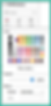
Drag Measure Values to the Columns shelf. This is in your Data pane underneath all of your Measures.

This action will add all of the calculated fields you have in your workbook to a Measure Values card that appears.
You will also have three Marks cards, one for All, one for SUM(Sales) and one for Measure Values.

You will need to remove them all except for the SUMZero calculation and SUM(Sales). You can hold the shift key down and select multiple pills at a time in this pane. You can then right-click on one and select Remove.

TIP: You must always have at least two measures on the Measure Values card or this function will be removed.
Your worksheet should appear as below;

The next step is to right-click on the Measure Values pill on the Columns shelf and make it a Dual Axis.

This action changes the view to Circles automatically instead of Bars.
TIP: Don't forget to synchronize the Axes!

On the Measure Values Marks card, change the Chart Type to Line.
Then move the Measure Names pill to Path. It should change your chart to a Lollipop!

This isn't what we want.
Move the Size Slider to the close to the end.

This will make the bars rounded!

Go to the Sales Marks card and change the Color View Modifier to White.
Swap the Measure Values to be in front of the Sales pill on the Columns shelf. This will bring the Sales circles to be on top of the rounded bar.

Want a Grand Total Bar? Go to the Analysis menu and select Show Column Grand Totals.

Then go to this menu again and select Column Totals to Top.
TIP: It's a best practice to sort your bar charts from Highest to Lowest.

Then you can right-click to get to the Format menu (selecting Format Borders) to remove the Column and Row Dividers. You can also click on the Format Lines menu to remove Grid lines.

TIP: Gridlines and Borders can create what is called Visual Noise. They don't add anything of value to the visualization, so why have them in the view?
I also recommend hiding the Headers and Field Labels.
On the Sales Marks card add the Sales to the Label view modifier. This will place a label at the end of the rounded bars.

The last step is to add color to your rounded bars! Place Segment onto Color View Modifier of the Measure Values Marks card to do so.

That's it! Refer to the previous week's blog here to change the Label to display at the end of the Grand Total bar so it won't overlap.