How to Create a Unit Chart
- Jun 15, 2021
- 2 min read
Have you ever wondered how to create a population chart with people icons representing a portion of the population? These types of charts are called Unit Charts and are also known as Pictogram Charts.
The calculations in the below blog were modified based on this article by Chris Love in the Information Lab site.
Here is an example of a Unit Chart using Sample -Super Store Dataset

In order to create a unit chart you will need to create a series of Parameters below;

The second parameter you can adjust how many people each icon represents. In this example I used 30.
You will also need to create the following Calculated Fields;
RowID
((index()-1/[Person Size])%([Grid]))+1
ColumnID
int(((index()-1)/[Person Size])/[Grid])+1
Person Filter
(index()-1)%[Person Size]=0
Label
If[RowID]=1 then str(window_sum(count([Customer ID])))+" Customers" End
Set up your dashboard as follows using the Sample-SuperStore data set;
Place Sub-Category on the Rows shelf.
Place Customer ID on the Detail card of your Marks Cards.
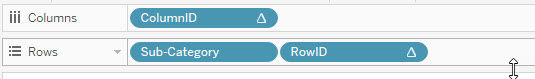
Next place ColumnID on the Columns shelf. Change the format of this pill to Discrete, by right-clicking and selecting Discrete.
Then add the RowID to the Rows shelf, next to Sub-Category. Also change the format of this pill to Discrete.
Next, change the format of the sheet to Entire View.
Add the Person Filter to the Filter card.
Right-click on this filter and select Compute Using > Customer ID.
A filter pop-up menu will appear both times. Select True for both prompts and then click OK.
Change the Mark type to Shape. Pick a shape of whatever icon you wish to use. I chose an icon from the Gender folder.
You can also adjust the size of the icon using the Shape slider.
Drag the Label calculated field to the Label Marks card.
Right-click on the Label text pill to select Compute Using > Customer ID.
Then select the right alignment for Label. This will enable the label to display only at the end of a row.

Proceed to hide the headers.
Remove the gridlines from your worksheet.
You have just created a Unit chart!

Comments