How to Create a Dendrogram Chart
- Sep 7, 2022
- 3 min read
In the blog below, I review the steps created by Data Viz Canvas to develop a Dendogram Chart in this youtube video here; except, I will be using the Game of Thrones Deaths data set from Data World here. I added a column called "Row Count" with the value of 1 for every row in this data set.
In the Youtube video, they use the Sample-Superstore dataset.
You will need to have your data source connected in your Tableau Workbook. I double-clicked on the sheet 1 to make sure it will show as below;

This will allow me to join this dataset for the step below.
You will need to type the following in an Excel spreadsheet, copy it, and then paste it in your Data Source pane next to Sheet 1;

Tableau will automatically try to join the two datasets together but you will have to set the Join Clause.
You will need to join your pasted dataset to the previous data set by clicking on the Create Join Calculation from the Join pop-up menu drop-down.

Enter 1 in the pop-up menu. Then repeat this step under the other Sheet so it will appear as below;

Then go to a new worksheet in your Tableau Workbook.
You will need to create a Bin on the Path metric, by right-clicking on Path and selecting Create > Bin.
You will need to create the following Calculated fields in this order;
Values*
WINDOW_SUM(SUM([Row Count]))/2
*The Window sum function will return the sum of the expression within the window or viewable space on the worksheet. You can replace my Row Count with a measure like [Sales].
TotalValues
WINDOW_SUM(SUM([Row Count]))/2
Percentage
[Values]/[TotalValues]
PercentageAdjusted*
[Percentage]/Window_MAX([Percentage])
*Window Max is like Window Sum and it will return the maximum of the expression within the window.
Rank*
RANK_UNIQUE([Values],'desc')
Returns the unique rank for the current row. This calculation has a default of descending order. Null values are ignored in ranking functions.
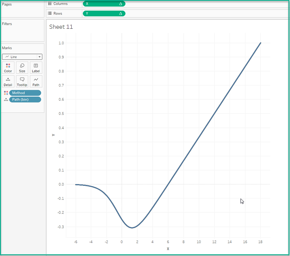
X
(Index()-1)*0.12-6
Sigmoid*
1/(1+EXP(-[X]))
*Sigmoid calculations help create the curve in your charts.
Y
[Sigmoid]*([Rank]-(WINDOW_MAX([Rank])+1)/2)/100
Size*
IF [X] >=6 and [X]<= 6+(10*[PercentageAdjusted]) then 1
else 0
END
*This calculation will help with the size of the bars that overlay the Dendrogram.
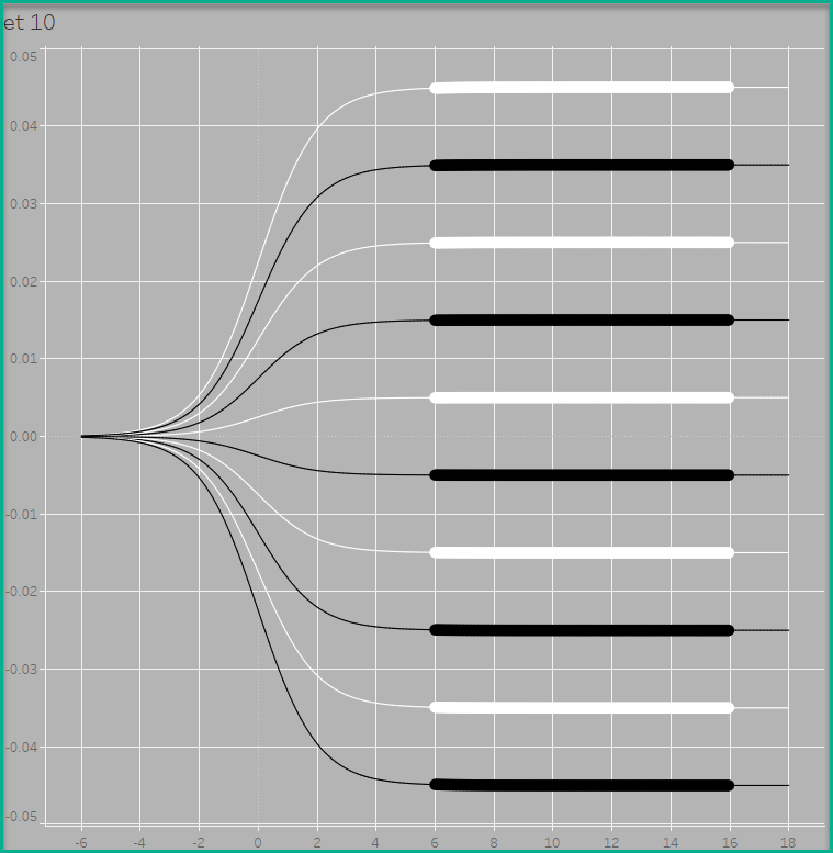
Next change the Mark Type from Automatic to Line.
Place the Dimension you want onto the Color Marks card. I used Methods. You can use Sub-Category if you are using the Sample - Superstore dataset.
Place the Bin you created onto the Columns shelf.
Make sure you right-click and select Show Missing Values.
Then move it to the Detail Marks card.
Move your X calculated field to the Columns shelf.
Then move your Y calculated field to the Rows shelf.
Right-click on the X calculation. Select Compute using and select your Bin field.
Repeat this step on the Y calculated field on the Rows shelf.
You should start to see a line with a curve.
Go back to your Y calculated field on the Rows shelf and select Edit Table Calculation.
You will need to check the box for the metric you put on the Color Marks card. For me, it was Method, if you are using the Sample-Superstore dataset, this would be Sub-Category.
You will also need to uncheck the box for the Path(bin) field.

Then select Rank from the drop-down on this pop-up menu. Uncheck the Path(bin) box and check the box for Method (or Sub-Category). You will start to see the chart in the background.

Then close this menu.
I added a filter to pull the Top 10 on Method by Row Count in order to reduce the number of lines.
Place the Size calculated field onto the Size Marks card.
Right-click on this field and select Compute Using > Path(bin).
You should start to see the bars on the lines, but they are all the same length.
Select the down arrow on this Size field and select Edit Table Calculation.
Make sure you select Total Value from the drop-down. Move Method (or Sub-category) above the Path(bin). Make sure both boxes are checked.

Then select Percentage Adjusted from the drop-down. Perform the above steps for this metric. Then close out of this pop-up menu.

You will start to see a variation in the length of the bars.

I edited the Y axis and checked the box for Reversed in order to have my longest bar at the top of the worksheet.
I also removed gridlines, etc. for this worksheet.
This chart is at the bottom of this dashboard in my Tableau Public site.

Finding the best interior designers in Bangalore can be a challenge, as the city is a hub for talented professionals. Our website simplifies your search, offering a curated list of top interior designers with detailed profiles and portfolios. Whether you're seeking luxury residential or sustainable commercial design, you can easily find the perfect match to transform your space. Visit our site to explore the work of leading interior designers in Bangalore and start your project today.Finding the best interior designers in Bangalore can be a challenge, as the city is a hub for talented professionals. Our website simplifies your search, offering a curated list of top interior designers with detailed profiles and portfolios. Whether you're seeking luxury residential or sustainable commercial design, you can easily find…