Enhancing Your Line Chart
- Apr 17, 2024
- 2 min read
Do you have a regular line chart in your dashboard? Here are some methods to take it to the next level!
If you want to watch a video about this instead of reading the steps, I made a YouTube video here!
Steps
I created a simple line chart using the Sample Superstore dataset.
I placed Order Date on the Columns shelf and changed it to Continuous Month format.
Then I placed Sales on the Rows shelf.
I went to the Format menu and selected Workbook to remove all of the gridlines, zero lines and axis rulers.
Then I went to the Analytics tab and added an Average Line to the worksheet. This is found in the Summarize section.
I then right-clicked on the Average line and selected Edit.
On the Edit Reference Line, Band, or Box pop-up menu I selected Custom from the Label drop-down. Then in the field that appears I typed AVG and a space. Then I inserted the Value from the > menu. (As shown below)
I then changed the Line to be a dotted line.
I then clicked OK.
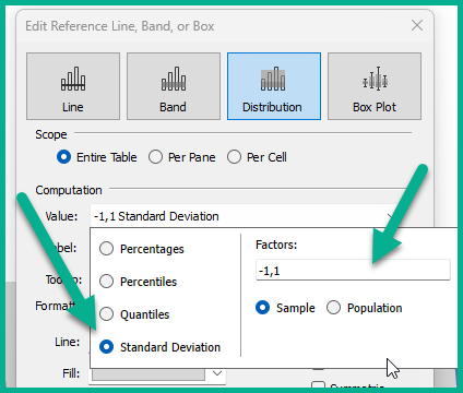
The next thing I added was a Distribution Band. I thought it would be interesting to display the Standard Deviation.
Under Custom on the Analytics tab, I dragged Distribution Band to the worksheet on Table.
On the Edit Reference Line, Band or Box pop-up menu I selected Standard Deviation as the option for this band. I left the Factors as -1, 1.
I selected the Value for the Label.
I then selected a light grey for the Fill color.
I also unchecked the option to Show recalculated band for highlighted or selected data points.
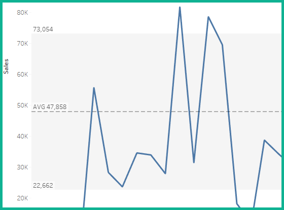
I then clicked OK. This made the line chart appear as below;
I thought it would be interesting to make this a dual axis chart.
I then clicked on the SUM(Sales) on the Rows shelf and held my CTRL key down to duplicate this pill. I then placed it next to the other SUM(Sales) on the Rows shelf.
I selected Dual Axis from the drop-down on the second SUM(Sales) pill.
I also right-clicked on the secondary axis to synchronize it.
I then changed the second SUM(Sales) to be a Circle Mark type. I increased the size of the circles a little bit.
On the first Sum(Sales) marks card. I changed the color of the line to a grey.
The chart appeared as below;
But how would I call out the dots above and below the standard deviation? Here is a calculated field to use to place on Color of the second Sum(Sales) Marks card.
STD Color
IF SUM([Sales])<(WINDOW_AVG(SUM([Sales]))-
(WINDOW_STDEV(SUM([Sales])))*1) then 'Bad'
ELSEIF SUM([Sales])> (WINDOW_AVG(SUm([Sales]))+
(WINDOW_STDEV(SUM([Sales])))*1) then 'Good'
ELSE 'Expected'
END
This calculated field will color any of the ones above the band with a color for the label "Good". I changed this to a blue color.
All of the dots in the Standard Deviation Distribution band will be a separate color labeled "Expected". I changed this to grey.
Then any below the band will be labeled "Bad". I changed this color to red.
Now the only thing left to do it to remove the axis title for the bottom axis and abbreviate the month dates to "mmm yy"!


Comments