Create a Sankey Diagram on a Map
- Dec 6, 2021
- 3 min read
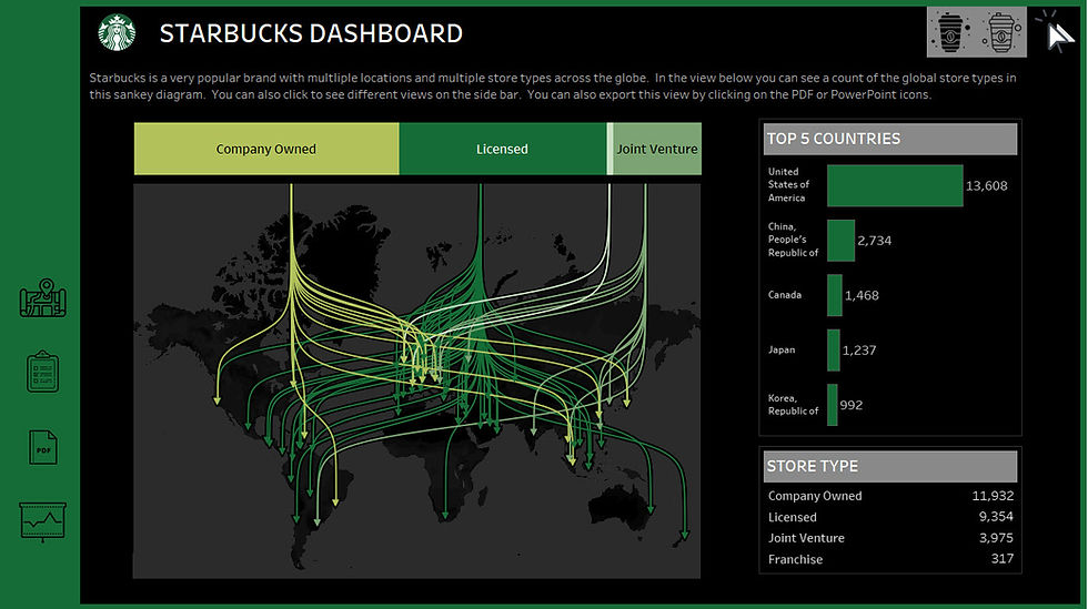
If you saw the 2020 Iron Viz, one of the winners, Christian Felix, created a stunning visualization with lines across a map (listed here). It looks like a Sankey diagram pointing to locations on a map.
I recreated the below visual for a Starbucks dashboard where I added navigation buttons to switch the dashboard from a dark theme to a light theme (located here).

I found a delightfully easy to follow video on how to recreate this Sankey map on youtube by Amit Bhat here. I modified the steps and have them listed below;
You will need to prepare your data a certain way for this visual.
I created an excel spreadsheet with three tabs, titled Data, Densification and Coordinates.
Here is a preview of the Data tab.
I added a column called Join and put the text "Link" in it. I then copied this cell all the way to the end of the country list.

In the same Excel workbook I added another spreadsheet called Densification.
I created a column called Join and a column called Point. In the Join column I put the word "Link" and pasted this all the way down to row 101. In the column called Point, I entered the data 1-100. Row 2 containing the number value of 1 and then row 3 containing 2, all the way down to row 101 with the value of 100.

The last worksheet I needed to create in this Excel workbook was called Coordinates. Here I had columns called Country Name, Longitude and Latitude.

In Tableau I put data worksheet onto my data pane. I then connected it to the Coordinates sheet by dragging it onto the data pane and then I connected the data tab to the Densification data set.

On my Worksheet in Tableau I needed to make sure Latitude and Longitude had a Geographic role. I did this by right-clicking on the icon next to the metric, selecting Geographic role and then clicking on the matching name.
(You may need to get this from Country Name through the drop-down settings) I also made sure they were Dimensions and Decimal number (not strings).
I needed to create the following Calculated Fields;
Start X
CASE [Ownership Type]
WHEN 'Licensed' THEN 45
WHEN 'Company Owned' then -75
When 'Franchise' then 127
WHEN 'Joint Venture' THEN 150
END
*This separates the Sankey into the 4 start points
Start Y
90
* You can enter a negative number here if you want the start point to be at the bottom leading to the top.
# Point
100
Sigmoid
1/(1 + EXP(0.2)^ -(([Point]-([# Point]+1)/2)+([Latitude]-[Start Y])/([# Point]-1)))
*Latitude needs to be a number or this calculation won't work.
Curve X
[Start X] + ([Longitude]-[Start X]) * [Sigmoid]
*Make this a geographic role and assign Longitude
Curve Y
[Start Y] + ([Point]-1) * ([Latitude] - [Start Y]) / ([# Point]-1)
*Make this a geographic role and assign Latitude to it.
Arrow
IF [Point] = 100 THEN 100
ELSE 0
END
First I placed the Curve X calculated field onto the Columns shelf. I right-clicked on this pill and selected Dimension.
Then I placed the Curve Y calculated field onto the Rows shelf and made sure it was formatted as a Dimension.
Once I did this the Sankey visualization started to form;

I changed the Chart type on the Marks card from Circle to Line.
I put Ownership Type onto the Color Marks card.
I then placed Country Name onto the Detail Marks card.

To add the arrows at the bottom of the lines I put another Curve Y calculated field onto the Rows shelf.
I made sure it was formatted as a Dimension, and selected Dual Axis.
On the second Marks card for Curve Y. I put the Arrow calculated field onto the Shape Marks card.
For the 0 value I used a Blank shape. For the 100 value, I selected the down arrow. In this previous blog I mentioned 3 shapes you should have, with Blank being one of them.

Now the only arrow that should appear will be at the bottom of the line.
If you want to make the start lines appear closer together, simply modify the Start X calculated field.
Modified Start X
CASE [Ownership Type]
WHEN 'Licensed' THEN 0
WHEN 'Company Owned' then -25
When 'Franchise' then 25
WHEN 'Joint Venture' THEN 50
END
Here's the image with the modified calculation above;

You can put an over lay above the map on your dashboard. I created a separate worksheet with a Stacked Bar Chart for the different Ownership Types.
I also modified my Maps using the Map menu in Tableau.

Comments