What is Top-Down Design?
Have you ever heard of this term? When creating dashboards, it's a great method to assist with executive reporting. What it means is to start with your simplest metrics at the top of a dashboard and get more granular with your chart selections as you go down.
It's a best practice to put KPI or charts that start with high level goals at the top.
Then you break your visualizations down to the raw data needs. It will help strategically answer your clients' questions.
For guidance on what questions you should ask your clients in the gathering phase, refer to my past blog article here.
Design Examples in Tableau Public
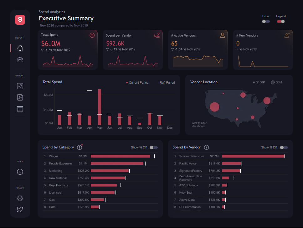
I like that Pradeep put combination KPI's at the top of his dashboard with a line graph underneath. Not only do you answer the overview metric of spend in this dashboard but the user can also see the values over time.
Beginner User Tip: One observation I have for beginner users is that you don't have to have large line charts on a dashboard. You can make them much smaller.
by Chimdi Nwosu

In this dashboard, Chimdi walks you through several other tips on what to consider with best practices for business dashboards including the following;
Apply white space
Ensure proper text use
Elevate Chart Choices
Use Color purposely
Eliminate Noise
Beginner User Tip: Don't be afraid to go to click on a chart in your dashboard and adjust padding on the Layout tab. Padding is your friend!
by Anna Mandoki

Top-down design isn't the only method for KPI's. There is also Left to Right as shown in Anna's dashboard above.
Her dashboard has a lot of interactivity which is a great method for keeping your clients engaged. You simply click on the month in the bar charts and the rest of the visualizations on the right will change accordingly.
Beginner User Tip: Inserting a Month Parameter in the title of your dashboard helps users see which month they selected in the bar charts.
