Can I Make My Gantt Charts Pretty?
In my previous post Level Up Your Gantt Chart I displayed a different way of having a Gantt chart with a Dual Axis.
I know of one more trick to these charts, use a Reference Band in between two date lines!
The chart example is below!

Steps:
First I put the Order Date on the Columns shelf. I formatted it as Exact Date.
Then I put Order Date on the Filters shelf. I filtered by the last date available (November 30th, 2025 in this data set).

I then put Product Name on the Rows shelf.
I clicked on OK from the Tableau pop-up message telling me that there are a lot of members. Even though I received this message, there were only 15 products for this date.

Then I put Ship Date on the Columns shelf and formatted it as Exact Date.
Then I clicked on Ship Date to make it a Dual Axis.
I then synchronized the axes.

I switched the Ship Date on the Columns shelf to be AFTER the Order Date.
On the Ship Date Marks card, I removed Measure Names from Color.
I changed the default color to pink.
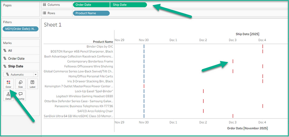
I then put Order Date and Ship Date onto the Detail marks cards.
I went to the Analytics tab to drag the Reference Band onto the Cell of Order Date for the worksheet.

I changed the Band To drop-down to Ship Date in the Edit Reference Line, Band or Box pop-up menu. I also changed the Maximum drop-down to Minimum.
I then clicked OK.

Now it was time to perform some housekeeping!
I right-clicked format on the worksheet and went to the Format Borders menu.
I changed the level of the Row Divider to move to the end.
Then I picked the thickest line and selected the color white.

I also removed the Column Divider.
I changed the alignment of the Product Name column to be left aligned.
I hid the top header.
I edited the bottom axis to delete the Title.
I created the below calculation to place this on the Label of the Ship Date Marks card.
Days to Ship
DateDiff('day',[Order Date],[Ship Date])
I then clicked on the Label to type 'days' after the calculation.

Try it yourself!
